Role:
Lead UX/UI Designer
Responsible for end-to-end app design, including user flows, interface design, component system development, and map interaction UX. Worked closely with developers, project managers, and stakeholders through weekly sprints to deliver a production-ready iOS + Android experience.
Overview:
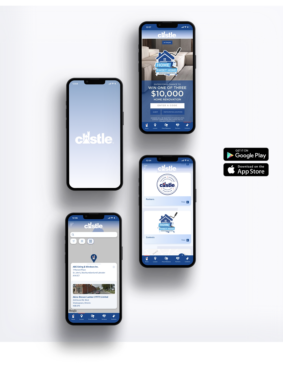
Castle Building Supplies needed a more efficient way for customers to find local retailers across Canada. Their existing locator tool felt outdated, slow, and difficult to use on mobile — despite mobile being the primary device for most users.
The goal was to turn this essential function into a standalone, modern mobile app that made it incredibly easy for homeowners and contractors to locate nearby stores, view details, and navigate quickly.
Challenge:
The original locator presented several issues:
-
Poor mobile usability
-
Slow and outdated interface
-
Limited filtering options
-
No clear UX around map interactions
-
Inconsistent UI with Castle’s updated branding
-
No unified visual system shared with the main website
Castle needed not only a UI refresh, but a complete UX overhaul tailored to mobile usage.
The project ran over several months, covering discovery, user journey mapping, prototyping, multi-round stakeholder reviews, and close dev collaboration.

Approach:
1. User Flows & IA
I mapped out the core user paths for homeowners, contractors, and first-time visitors:
-
Quick search from the home screen
-
Filter by distance, store type, and available services
-
Map-first browsing for users on the go
-
Clear “Store Details” view with hours, location, and contact info
This ensured that the app served the widest range of user intents with minimal friction.
2. Interface & Interaction Design
I designed a modern mobile interface with:
-
A simple onboarding flow
-
A clean search field anchored at the top
-
Fast, thumb-friendly filtering controls
-
A map-first experience with location previews
-
Detail pages showcasing store info, hours, and directions
The UI emphasized clarity, legibility, and quick scanning — crucial for mobile contexts.
3. Design System
To unify the web and mobile ecosystem, I developed a shared system including:
-
Spacing / grid rules
-
Buttons, toggles, and inputs
-
Cards and list layouts
-
Store detail modules
-
Map pins & interaction states
-
Light + dark usability considerations
This allowed devs to build faster and maintain consistency after launch.


Outcome:
The Store Locator app now provides a fast, reliable way for customers to find local stores anywhere in Canada.
Key improvements include:
-
A modern, mobile-first map experience
-
Faster search and filtering
-
Consistent UI across web and app
-
More reliable navigation and store info
-
Cleaner brand presence
Impact (from broader Castle digital efforts):
-
254% increase in app downloads
-
90% improvement in user retention
-
37% increase in contest signups
The app is now live in the App Store and supports thousands of customers across Canada.
Let’s build something together.
© Alexander Braga